Why "fi" and "fl" go missing when software reads your resume PDF
· 6 min read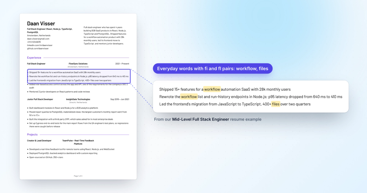
When "efficiency" comes out as "eciency" or "workflow" as "work ow", your PDF uses ligatures: the font draws "fi", "fl", "ff", "ffi" and "ffl" as one joined glyph, and the software reading the file did not turn that glyph back into letters. Export again with ligatures turned off and every letter is stored on its own.
Below is how to check your PDF in a minute, and the setting for each tool engineers use to build a resume.
What a ligature is
In many fonts, the hook of the "f" runs into the dot of the "i" or the top of the "l". So the font includes a single glyph that draws the pair joined, and the layout engine swaps the two letters for it. LaTeX, browsers, LibreOffice and most design tools do this by default. Word does not, unless the ligature setting has been changed.
A PDF stores glyphs, not letters. For search and copy to work, it also stores a map from each glyph back to the text it stands for. That map is where things go wrong, in three different ways.
The three ways a ligature breaks
Both letters disappear. The glyph has no entry in the map, or points to a private code that means nothing outside the font. Many extractors drop it without a trace, sometimes leaving a space:
Before (glyph with no mapping)
Cut CI pipeline time from 22 to 9 minutes by caching Docker layers
Moved the oine sync queue to IndexedDB
Built a trac shadowing step before each release
After (no ligatures in the PDF)
Cut CI pipeline time from 22 to 9 minutes by caching Docker layers
Moved the offline sync queue to IndexedDB
Built a traffic shadowing step before each release
This is the most common case, and the one most people searching for this have seen.
One special character instead of two letters. Unicode has single characters for these pairs, such as "fi" (U+FB01) and "fl" (U+FB02). Some PDFs map the glyph to them. The text looks right when you paste it, but a search for "fi" does not match "fi" unless the software normalizes it first.
Only the first letter survives. The map is correct ("fi" maps to "f" and "i"), but the software reading it keeps one character per glyph. We saw this ourselves when an AI tool read a resume and reported back:
fntech · confrmed · frst · efciency · Cloudfare
In all three cases, only words with "fi", "fl" or "ff" are damaged. A scanned image loses everything, and a broken font usually garbles whole words.
Engineering words that contain these pairs
Many engineering terms contain one: "workflow", "configuration", "profiling", "traffic", "feature flags", "Dockerfile", "Cloudflare", "offline".
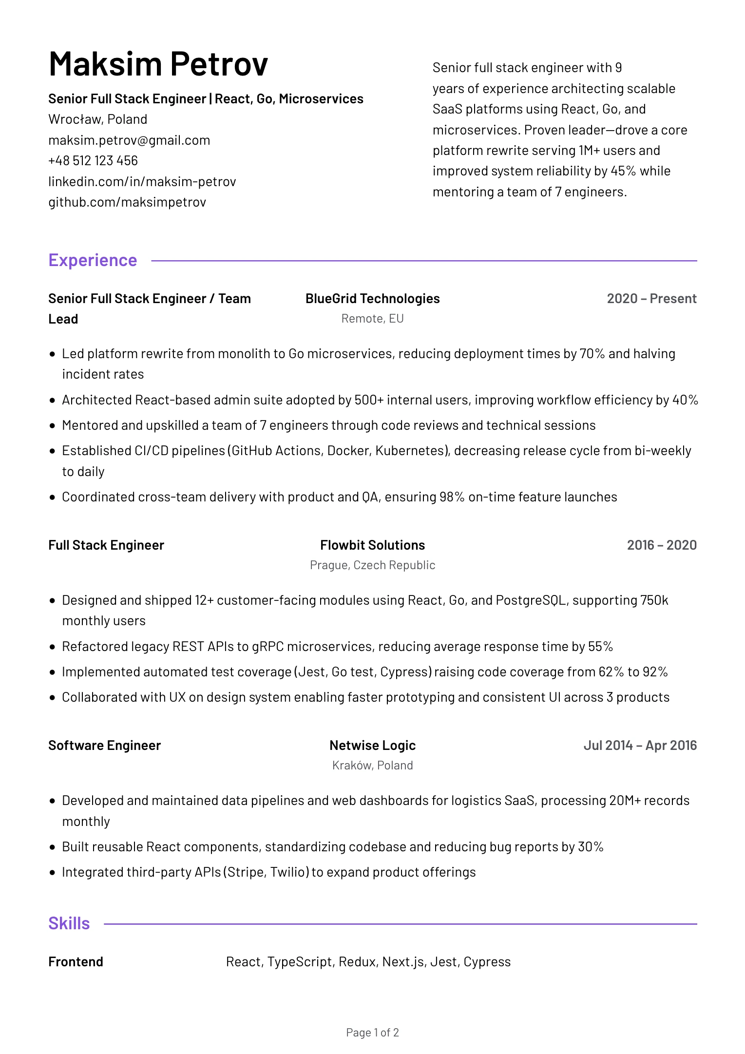
Here are two real lines from our mid-level full stack engineer example, under FlowSync Solutions, as they would come out of a PDF whose ligature glyphs have no mapping:
Before
Shipped 15+ features for a work ow automation SaaS with 28k monthly users
Led the frontend's migration from JavaScript to TypeScript, 400+ les over two quarters
After
Shipped 15+ features for a workflow automation SaaS with 28k monthly users
Led the frontend's migration from JavaScript to TypeScript, 400+ files over two quarters
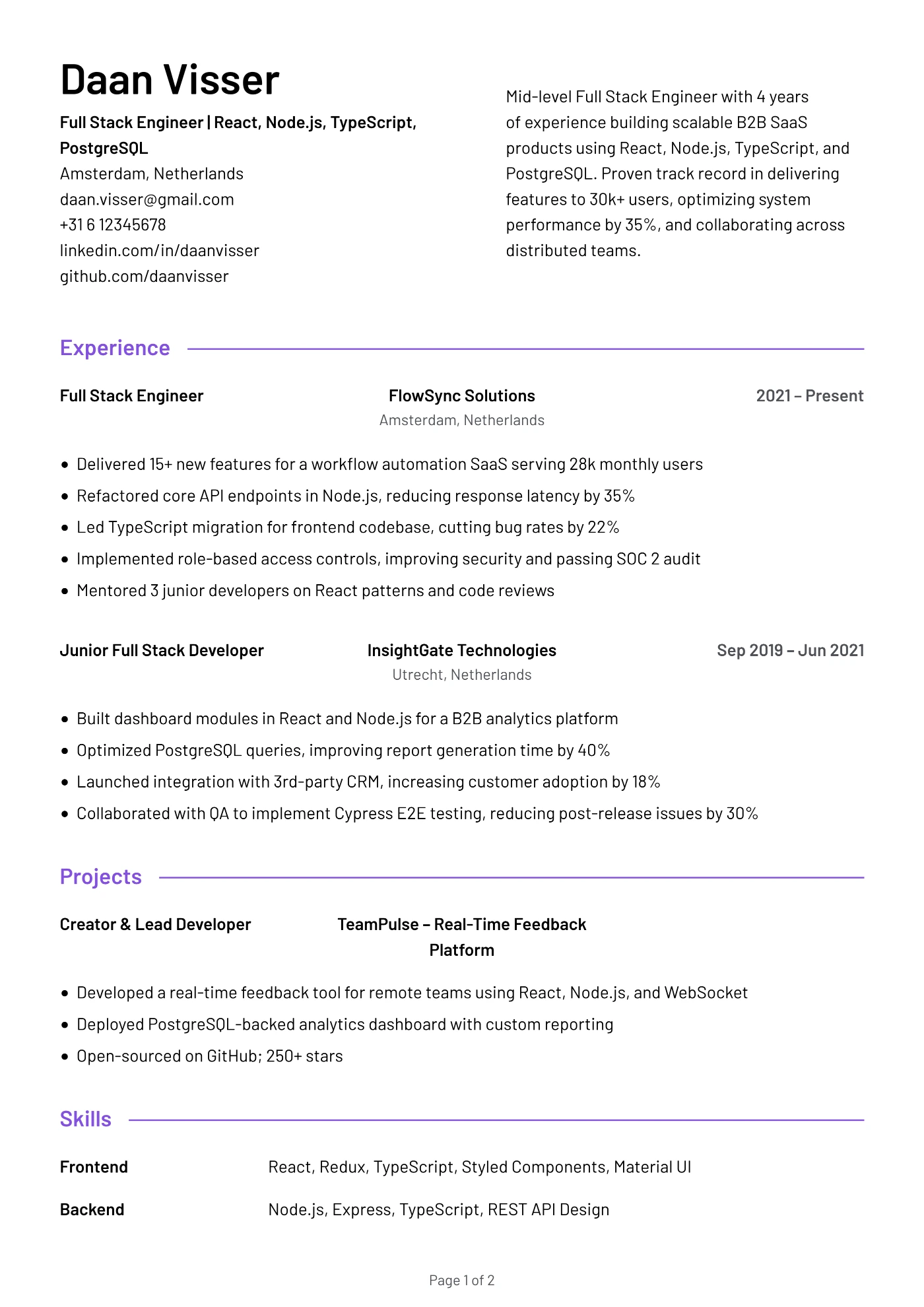
Mid-Level Full Stack Engineer Resume Example
"workflow" and "files" in the first role's bullets
View the full example
The capital "F" in "FlowSync" is safe, because fonts rarely join a capital F to the next letter.
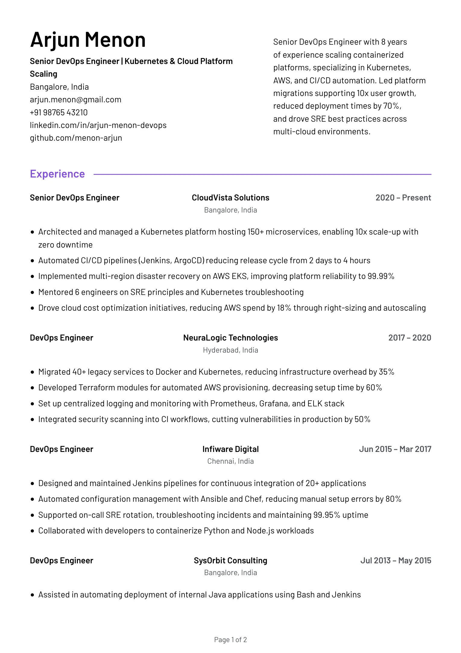
The senior DevOps engineer example has the same exposure in "Moved server configuration into Ansible and Chef" and "Wrote Dockerfiles for the Python and Node.js services". Both are terms a keyword search could look for.
How to check your PDF
Start with the common test: select all text in the PDF, copy it, paste it into a plain text editor and read the words with "fi", "fl" and "ff". If letters are missing, you have the first case, and the fix is below.
A clean paste does not clear the file. A pasted "fi" looks exactly like "fi" in most editors, and your viewer may repair text that a simpler extractor would not.
Two more checks find what the paste hides. In Preview or Acrobat, try to select only the "f" in a word like "file". If "fi" highlights as one block, it is a ligature glyph. Some viewers, such as Firefox's, let you select the letters one at a time even when they are joined, so try a second viewer before you trust a negative result.
If you have Poppler installed, this lists every line that contains one of the single ligature characters:
pdftotext resume.pdf - | grep -n '[fffiflffiffl]'Run pdftotext resume.pdf - on its own as well and read the output for "eciency" or "work ow". It also shows whether your columns come out in the right order.
How to export without ligatures
We recommend turning ligatures off where you write the resume, exporting again and repeating the checks.
Word. Ligatures are off by default. To confirm, select all, open Font (Ctrl+D, or Cmd+D on a Mac), go to the Advanced tab and check that Ligatures is set to None. If the PDF still has them, it was probably made through another app or a "print to PDF" printer, and exporting with File > Save As > PDF is worth trying.
LibreOffice. It applies the font's default ligatures. Adding :-liga to the font name in the font box turns them off, for example "Source Sans 3:-liga".
LaTeX with pdfLaTeX. The microtype package can turn off the ligatures that start with "f". The optional [f] matters: without it, -- stops printing as an en dash, and most resume templates write date ranges with it.
\usepackage{microtype}\DisableLigatures[f]{encoding = *}
Many engineering templates on Overleaf already include \input{glyphtounicode} and \pdfgentounicode=1. Those lines give the ligature glyphs a correct map, which fixes the first case but not the third. Keep them, and add the lines above.
LaTeX with XeLaTeX or LuaLaTeX. With fontspec, ask for the font without common ligatures:
\setmainfont{Source Sans 3}[Ligatures=NoCommon]Typst. Add this at the top of the document (Typst docs):
#set text(ligatures: false)HTML and CSS printed to PDF. The browser you print from changes the result. Chrome stores the original letters alongside the glyph. Firefox has been reported to map it to the single "fi" character (Mozilla bug 1810914). Either way, this rule in your stylesheet removes the ligatures (MDN):
body { font-variant-ligatures: none; }Design tools and web editors. If your tool has no ligature setting, change to a font that does not form them, then run the checks again.
If all you have is the PDF, for example an old export, rebuild it from the source document or copy the text into a new one. Running OCR over a resume creates new errors.
Which fonts form these ligatures
In our tests of the fonts our templates offer, Barlow, EB Garamond, IBM Plex Sans, IBM Plex Serif, Merriweather and DM Serif Display all form "fi" or "fl" ligatures by default. Inter does not. Sans fonts are not exempt: two of those six are sans.
Turning ligatures off keeps your font. The only change is that "f" and "i" print as two letters, which is hard to notice at resume sizes.
The widths of the joined and separate forms can differ slightly, so a line break can move after you export again. Check the page count and the last line of each section.
How much it matters
Many extractors read a correct mapping without trouble, and plenty of resumes with ligatures are read correctly. We have no data on how often this changes what a recruiter sees.
You cannot see which software reads your file. It may pass through an ATS and a job board's parser before a person opens it. We recommend turning ligatures off once, since it is one setting, and checking again when you change font or tool.
If you build your resume in Filiz, every template already exports without ligatures.
Put it into practice
Build your resume in Filiz and watch the PDF update as you edit. Start from scratch, import your current resume, or begin with an example. No sign-up needed to try it.
Frequently asked questions
Will an ATS reject my resume because of ligatures?
No. At worst some words come out with letters missing or as a special character, so a search for "workflow" or "configuration" may not match. The rest of the resume is read normally.
Does saving as PDF/A fix ligatures?
Partly. PDF/A versions with Unicode requirements (such as PDF/A-2u) need every glyph to map to text, which fixes a missing map. The ligature glyphs stay, and they can still map to the single "fi" character. Turning ligatures off at the source is more reliable.
Should I send a Word file instead of a PDF?
Only if the application asks for one. A DOCX stores plain letters, so ligatures are not an issue there, but the layout can shift on the reader's machine. A PDF exported without ligatures keeps both the layout and clean text.
Are other letter pairs affected?
The common ones are "fi", "fl", "ff", "ffi" and "ffl". Some fonts also join "ft", "st", "ct" or "Th", usually as optional ligatures that are off by default. The same checks find them.